
Digital Sovereignty - Comparison Analysis

As I continue my research on evaluating Digital Sovereignty in the context of Cloud Services and European providers, I was inspired by Simon Wardley's insightful post: https://medium.com/mapculture/on-digital-sovereignty-8d0ae0f22ab2
After diving deep into the ideas he presented, I've created a simple tool similar to Wardley Maps that can help both myself and my customers evaluate the feasibility of changing cloud providers. This tool provides a practical framework for assessing digital sovereignty considerations when making strategic cloud decisions.
What we will cover in today's post:
What to evaluate - We'll explore the key criteria that should be considered when assessing digital sovereignty in cloud services.
How to compare different options - I'll present a framework for objectively comparing various providers based on sovereignty factors and business requirements.
Where are my needs here - We'll discuss how to identify and prioritize your organization's specific sovereignty needs within the broader evaluation process.
Single Technology level vs. Helicopter View - I'll explain the importance of utilize both detailed technical assessments and a broader strategic perspective when making sovereignty decisions.
Final Decision - We'll cover a structured approach to making the final provider selection that balances sovereignty concerns with practical business considerations.
Okay, then let's start from the myriads of parameters you can consider when comparing solutions.
What to Evaluate - Sorting out Options
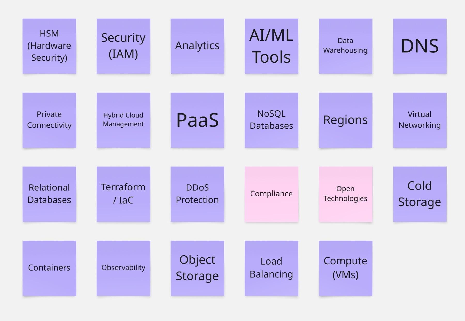
When I first tackled this problem, I started by mapping out the main capabilities I wanted to compare. The list you see in the picture? That's my personal take—you might find that your critical function is something wholly different, like Microsoft Defender's security platform. I've been in situations where what seemed important to me wasn't the priority for my clients at all!
I've color-coded things to make it easier to digest: technical capabilities are in violet, while broader concepts like Compliance Approach and Open Technology usage are in pink. I chose these broader concepts because, honestly, they're at the heart of most conversations I'm having these days about legal regulations and vendor lock-in concerns.
Now, your comparison criteria will naturally look different depending on what you're evaluating. That's perfectly fine—in fact, it's expected.
The real trick here (and I've made this mistake before) is to resist using someone else's template without customizing it. If you're looking at databases, you'll care about things like scalability and query performance. For cloud providers, you might be more concerned with where their data centers are located and what sovereignty guarantees they offer. Have you considered how your existing tech stack might integrate with these new solutions? That's something I often see overlooked until it's too late.
I've found that creating a framework that speaks directly to your organization's unique situation is far more valuable than trying to cover every possible angle. Too many comparison points? You'll get stuck in analysis paralysis. Too few? You might miss something crucial that bites you later. It's about finding that sweet spot.
And just between us—I'll dive deeper into this in chapter 4—you'll need different approaches when you're evaluating something broad like cloud platforms versus something more specific like Kubernetes as a Service.
When I build comparison matrices, I start by asking: "What are your absolute must-haves?" Then we add the "nice-to-haves" afterward. What's worked best in my experience is focusing on what matters most for your specific use cases rather than trying to boil the ocean. What's keeping you up at night about your current solution? That's probably where you should start your evaluation.
How to compare different options
Let's now deep dive into the framework I've developed based on Simon Wardley's post. It's not the complete Wardley Mapping exercise—I've simplified it to include only what's necessary for making comparisons.
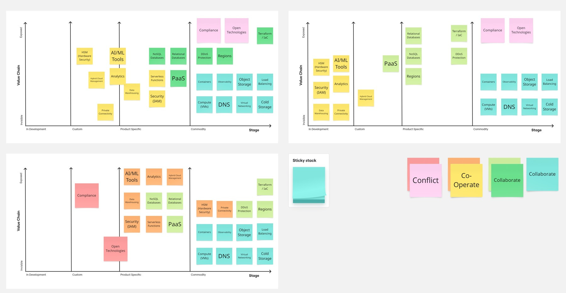
Then what we do here, I have compared 3 situations: in the left top you can find Europe's Future features positioning around our map, on the top right Europe's current positioning, and down on the left US current as a Reference point. Of course, a little highlight here - this is my subjective rating.
Let's talk about what the card colors mean and why they're located in certain places.
I started with blue cards, which represent things that remain in the same space across all charts. Usually, they fall in the Commodity category, but that's not always the case.
Then we have light green cards that turn into dark green in the future map. This means these are areas that currently don't match our reference but will catch up in the near future.
Both of these categories were marked as "Collaborate" as Simon suggested. These are areas where technology is developed and there's no value in conflict or competition with our US providers.
Moving to the more interesting categories, we have ones marked with orange that turn into yellow. This category represents areas where Europe will get closer to the reference in the near future but won't be able to match it completely or doesn't want to. These are areas where we might cooperate to shape the final vision.
Last but most controversial is the red and pink group. It represents areas where we expect something different from what the reference provides. I've included Compliance-related topics here and approaches to open-source solutions, which differ most significantly between US and EU solutions.
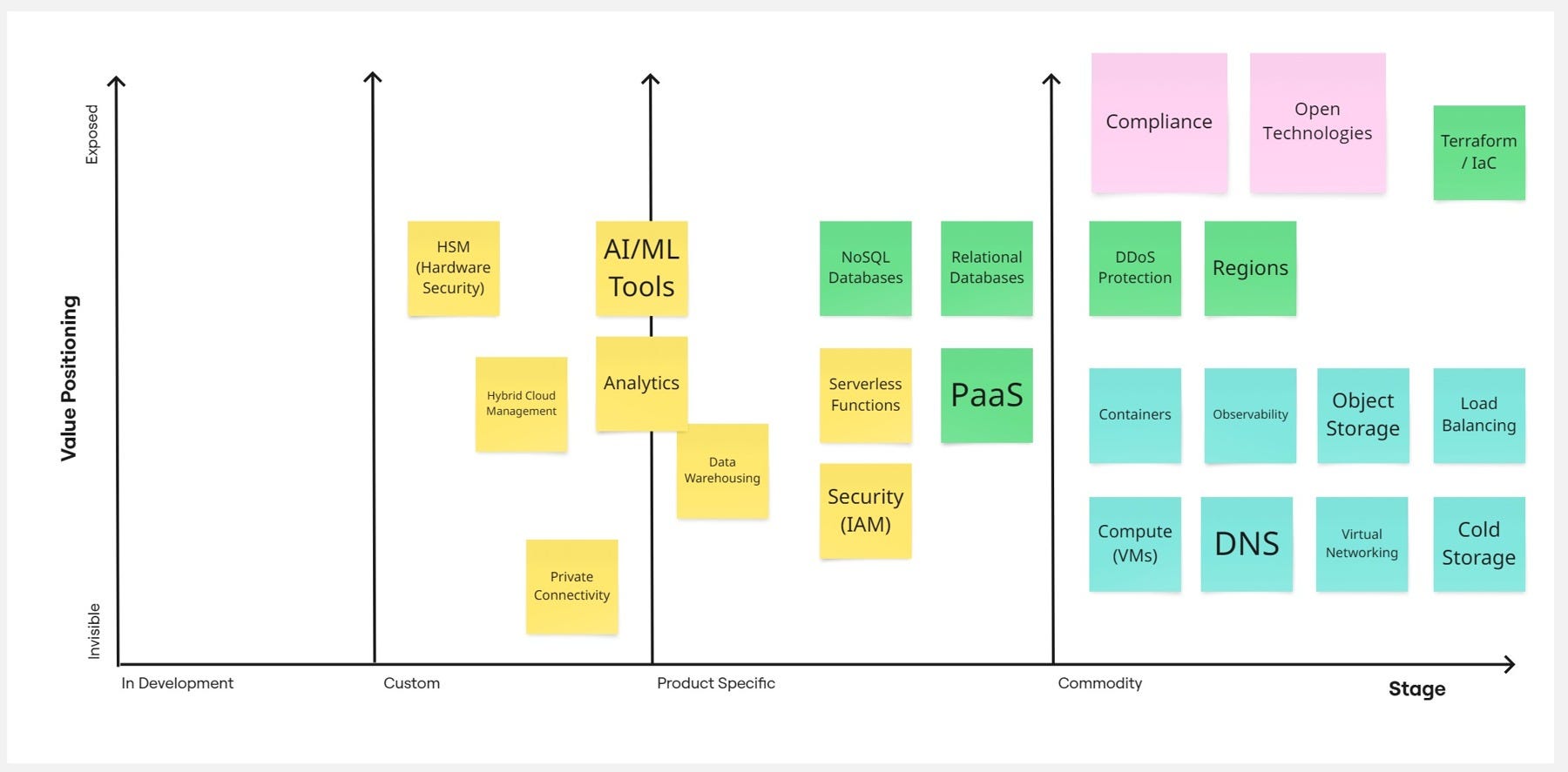
Now, let's discuss the background of the chart itself. From left to right, we have 4 grouping categories, starting from what I renamed as "in Development," moving through "Custom" and "Product Specific," and finishing with "Commodity." This represents whether a solution or feature is mostly standardized (Commodity), specific to certain products but following the same idea/architecture (Product Specific), customized (Custom), or completely lacking standards with providers creating entirely alternative solutions (in Development).
On the second axis, we have what I've adjusted to Value Positioning - whether a particular feature for a chosen group is invisible/core (not worth mentioning) or if it's our key feature that we highlight in our marketing.
With this map, we can recognize where features we care about land and how they might look, always considering the near future. I'm comparing Europe Current and Future with US Cloud providers as a reference, taking a market average. If you prefer, you can create separate maps for each provider, which would show, for example, that IBM Cloud takes Compliance much more seriously, Azure is somewhere in the middle, while AWS lands on the opposite side of this chart. You'll need to decide how deep you want to go with this analysis, which I'll discuss later.
Having such a map, however, is not full of the exercise is only your comparison "table" or "chart" that you use for final examination.
Where are my needs here
Maps themselves don't provide direct value; they're simply information that helps us compare our requirements with reality. What's important now is to consider our purpose for using Cloud in this case, and decide which features are crucial for our needs. We need to determine how essentially each feature is to us. Similar to how providers position certain features, we should decide how much weight we place on particular capabilities. Once we've done this evaluation, we can create our needs map accordingly.
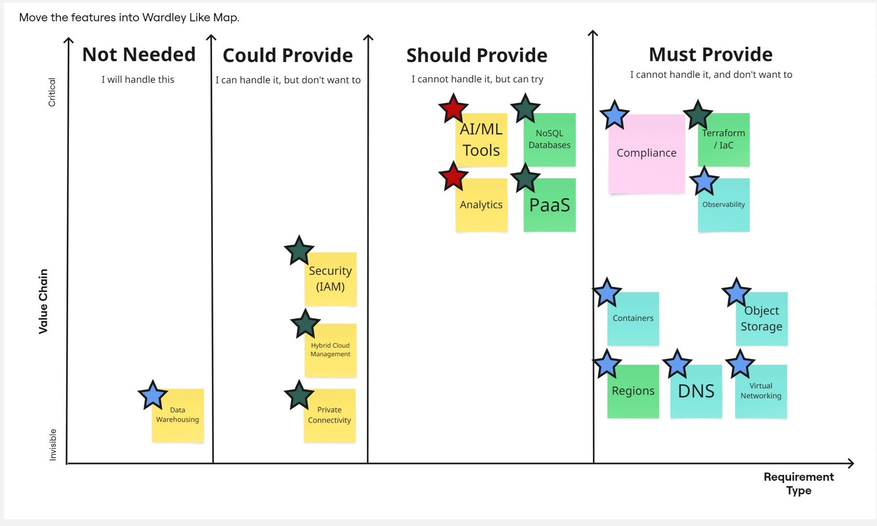
We use an adjusted version of the MoSCoW framework where I split required features into 4 categories:
Must Provide - Features I cannot handle and prefer not to learn. These are usually commodity items where I don't want to build skills.
Should Provide - Features I cannot handle right now but could learn if needed. These fall into our "product specific" mapping category, where I can learn more about how a particular provider implemented them.
Could Provide - Features I can handle, but prefer not to. I might take a custom approach here, as developing my own solution could be expensive or problematic.
Not Needed - Features I genuinely don't need, typically because I already have my solution, skills, external provider, or other resources that make me uninterested, though they remain part of my requirements.
The vertical axis simply defines what has high priority in your consideration, versus what is just a must-have.
A more interesting question is what the card colors represent. I copied these from my ideal map—the map I want to examine, in this case "Europe Future"—and selected only those in my requirements. I then moved them and placed them in the appropriate positions.
The stars represent the final element of our framework analysis.
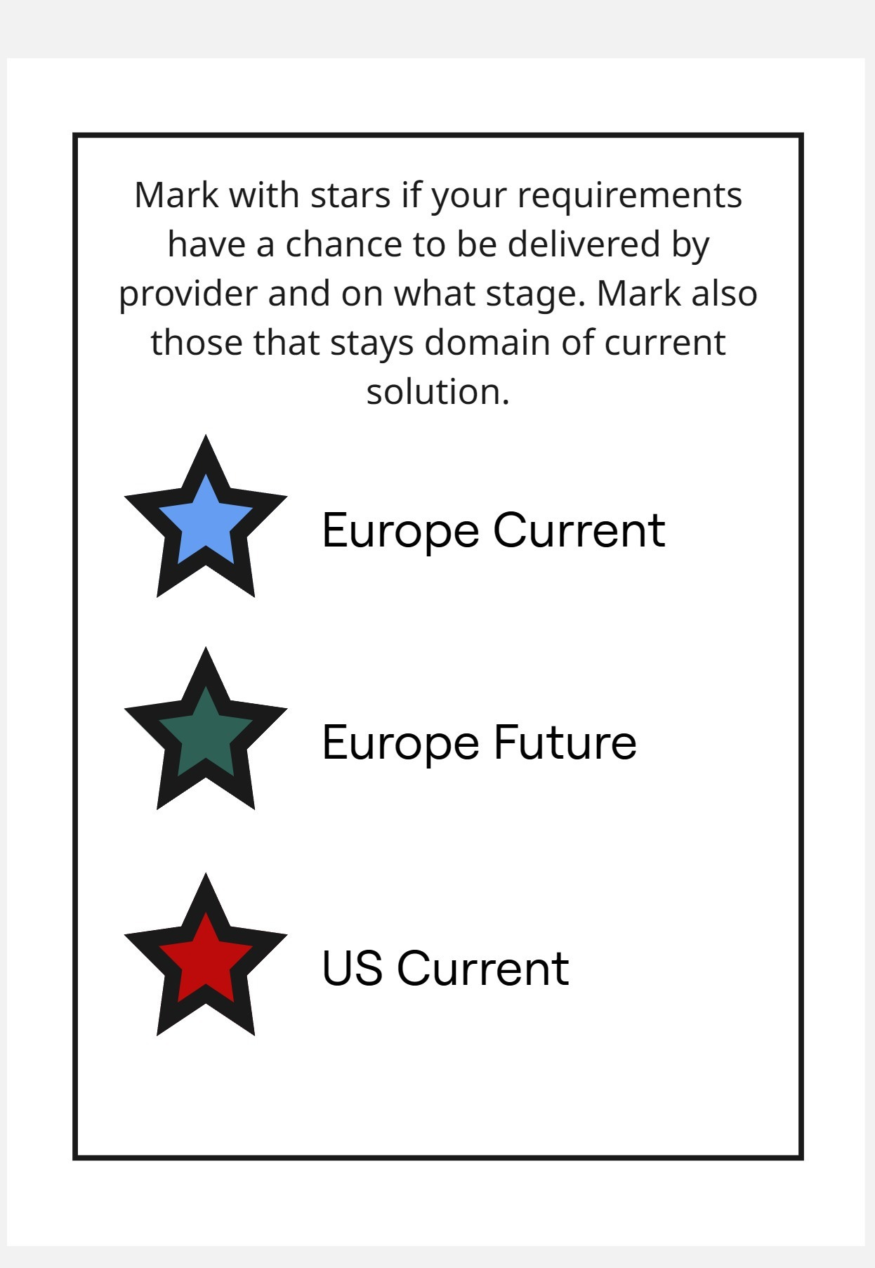
Colors of stars represent solution likelihood, from most likely to least likely to deliver our feature. I use a red star if only the US can deliver this feature, a dark green star if Europe can deliver it in the future, and a blue star for current European solutions.
These stars help you visualize where your problems are (red stars), when you might need to implement a temporary solution while waiting for a full one, and when we already have good enough solutions.
Red stars indicate topics that require discussion. Depending on where they fall in your MoSCoW prioritization, you can take different approaches—perhaps looking for more specialized providers, or even considering taking on the topic yourself, even if that wasn't your initial preference.
This creates a meaningful discussion point within your organization: what do we want to do with the red-starred items, and can we live with the green ones?
Single Technology level vs. Helicopter View
As I mentioned earlier, there are different levels of depth we can take in our analysis. We can maintain a "Helicopter View" by generalizing US and EU cloud providers, or we can dive deeper to compare specific services like Azure, IBM Cloud, and OVH. This flexibility in perspective allows us to adjust our focus depending on the specific requirements of the project and the questions we're trying to answer.
The depth of your analysis depends on what stage you're at in your decision-making process. If you're simply determining whether using US cloud providers is problematic from a regulatory or compliance standpoint, a high-level map will suffice. This broader view helps identify general patterns, major regulatory concerns, and potential red flags without getting bogged down in technical specifics. However, when discussing specific solutions and developing strategies to address them, you'll need a much more detailed analysis of particular providers. This granular approach becomes essential when evaluating factors like specific security certifications, data residency guarantees, contractual terms, technical capabilities, pricing structures, and support options.
Remember that cloud infrastructure decisions have long-lasting implications for your organization's technical architecture, compliance posture, and operational capabilities. Taking the time to analyze at the appropriate level of detail for your current decision-making needs will save significant headaches down the road. The key is matching your analytical depth to the specific questions you need to answer at each stage of your cloud strategy development.
Similarly, you can perform this type of comparison and analysis for specific features you're looking for, such as Database as a Service or Kubernetes as a Service. You can evaluate your business systems individually, recognizing that they may have vastly different requirements. For instance, one system might store commonly available data like temperature readings from Oslo weather stations, while another contains critical medical data of your clients. The feature map itself, feature positioning, and other considerations may differ significantly between these cases.
I prefer to start from a high level, moving through system-specific considerations before diving into provider-specific mapping. This approach ensures we can systematically narrow our options at each deeper stage of analysis.
Final Decision
When it comes to making your final decision, the framework I've presented isn't just about identifying the best technical fit—it's about understanding the complete risk landscape and developing appropriate mitigation strategies.
Start by consolidating your analysis from the previous steps. Gather all your maps with their colored cards and stars, particularly focusing on those red stars in your high-priority areas. These represent your critical decision points and potential sovereignty risks.
For each red star (areas where only non-EU providers can currently meet your needs), develop a structured risk assessment:
Impact analysis: What would be the business, legal, and operational impact if this capability were compromised or unavailable?
Regulatory exposure: Evaluate specific compliance requirements (GDPR, NIS2, DORA) that might be affected.
Transition feasibility: Assess how difficult it would be to migrate this capability to an alternative provider in the future.
Next, develop a mitigation strategy for each high-risk area:
Hybrid approaches: Can you use EU providers for sensitive workloads while leveraging non-EU providers for less critical functions?
Contractual safeguards: Explore enhanced data processing agreements, exit clauses, and sovereignty commitments from providers.
Technical controls: Consider encryption strategies, data residency configurations, and access management tools.
Planned transitions: For capabilities marked with green stars (future EU capability), develop a roadmap for migration when those solutions mature.
Document your decision-making process thoroughly. This serves both as protection in case of regulatory scrutiny and as a reference for future technology decisions. Include:
Your evaluation criteria and their weightings
Specific sovereignty requirements that drove decisions
Accepted risks and their mitigation strategies
Timeline for reassessment as the European cloud market evolves
Remember that digital sovereignty isn't binary—it exists on a spectrum. The goal isn't perfect sovereignty at the expense of business capability, but rather a balanced approach that addresses your most critical sovereignty concerns while enabling your organization to function effectively.
By applying this framework systematically, you transform what could be a politically charged or emotionally driven decision into a structured, evidence-based process that acknowledges the realities of today's cloud landscape while preparing for a more sovereign future.
Whether you've seen it or not, Digital Sovereignty is simply a matter of good old risk management practices focused on vendor lock-in. This applies both to vendors as companies and vendors as countries. While this concept feels new in the US context, it has been a familiar concern regarding China for quite some time.